1. Logo and Layout
The Keyloop logo appears in carbon or white, contrasting against the background.
The logo should always have clear space around it, and never be placed over anything that interferes with its legibility. Any distortion of the logo is ruled out, and the trademark symbol must never be removed or obscured.
White on Carbon
Carbon on White
White on Carbon
Carbon on White
Application
1.1
Logo safe area:
Logo safe area:
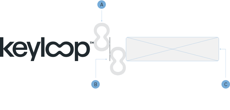
The Keyloop logo should always have clear space around it and never be placed over anything that interferes with its legibility. We use the Loop device to provide clear space on all sides, this is called the logo safe area.
The Logo safe area is arranged around the Keyloop logo and excludes the trademark ™ symbol. This acts a guide to the maximum size the Keyloop logo can be applied within a space.
1.2
Commercial lockup:
Commercial lockup:
Commercial lockups signify a partnership between Keyloop and a third party. The Keyloop logo may only be aligned with partner and customer logos within a
commercial lockup. Written permission is needed from the creative team before creating a commercial lockup for external use.
The Keyloop logo always appears on the left side of the commercial lockup, and the height of the third party logo must not exceed that of the Keyloop logo height.
We do, however, allow for the partner/customer logo to extend horizontally, to a maximum width matching the Keyloop logo width.
For third party logos, mono or greyscale colour should be prioritised, where possible. This is to help unify the look and feel with the Keyloop branding.
Loop device provides consistent and adequate spacing.
Dividing line anchors logos together. Always matching the height of the Keyloop logo.
Logos must not exceed the height of the Keyloop logo
Application Cont.
1.3
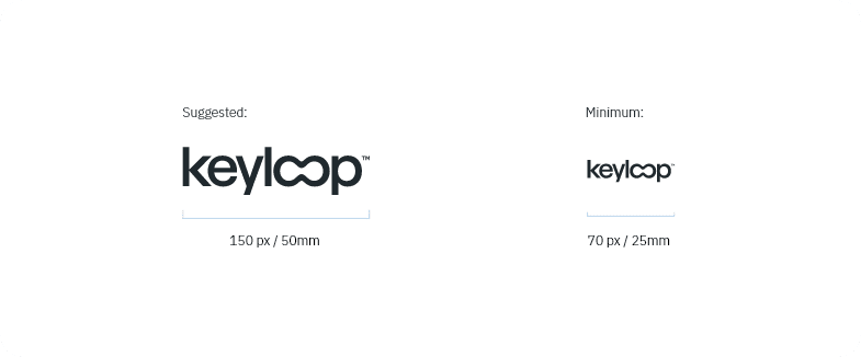
Logo minimum size:
Logo minimum size:
We provide a minimum logo size to ensure ledigibility for smaller applications of the Keyloop logo. For digital applications ensure the width is no smaller than 70px, for print applications ensure the width is no smaller than 25mm.
1.4
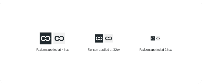
Favicon logo:
Favicon logo:
The goal of the favicon is simply as a reference to the Keyloop logo branding rather than trying to represent the full logo in such a small space.
It can only be used in the orientation, as displayed, and follow the same colour guidance as the main Keyloop logo branding, simply in carbon or white – depending on the background.
The favicon may be used for the smallest applications of the Keyloop logo, where there’s a requirement to go smaller than the minimum logo size.

1.5
Circular crop:
Circular crop:
Please use the following guidelines to ensure that the Keyloop logo branding is correctly placed within a circular shape.
The Logo safe area either side the Keyloop logo and excludes the trademark ™ symbol. This acts a guide to the maximum size the Keyloop logo can be applied within the circular space.
Arrangement
1.6
Flexible logo placement:
Flexible logo placement:
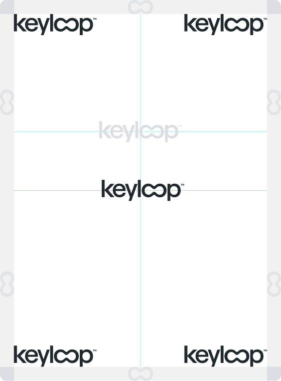
Positioning of our primary logo is located in the corners, or centrally, of our applications within the design layout.
We may also arrange the logo on the upper third of a layout, as displayed in light grey on the design to the right.
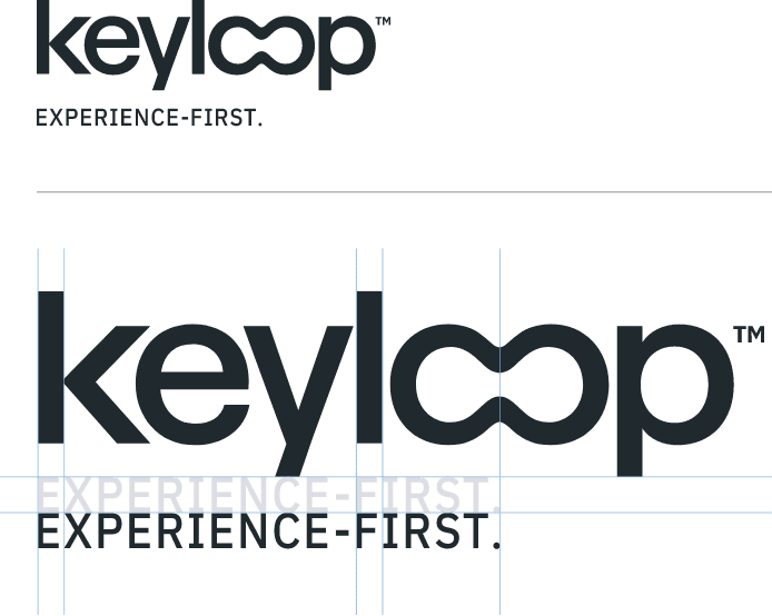
Experience-First lockup
1.7
Brand lockup:
Brand lockup:
This lockup combines the Keyloop logo branding with our core brand ethos, Experience-First.
The application, positioning and scale of the
Experience-First lockup follows the same guidance as the primary Keyloop logo.
Rules
Do

Do Not

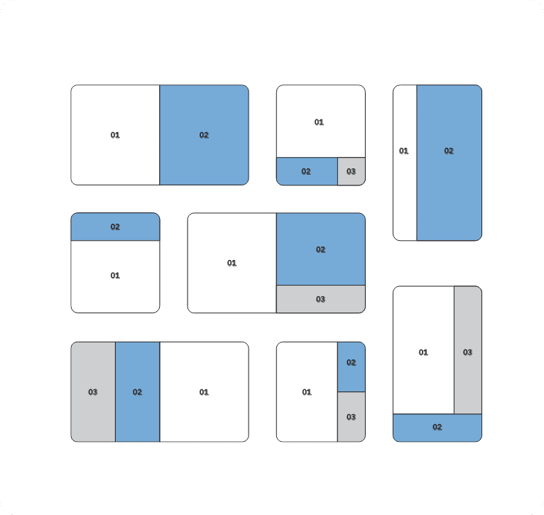
Layout and spaces
Flexible layouts divided into multiple spaces enable content to be conveyed clearly and precisely.
1.8
Creating spaces:
Creating spaces:
Whether one or many spaces: the division of the layout is geared towards the content of the message to be conveyed.
Layouts may feature one, or up to three divisions, both horizontally and vertically. The division is straight and bled to the edge; it can be either symmetrical or clearly asymmetrical. Both the number of the spaces and their size relative to each other is flexible.
2. Colour
Our approach to colour represents a bold, confident, trusted and sophisticated brand. We’ve structured our core colour pallet into three core aspects; Base, Primary, Secondary.
Core colour palette
2.1
Base colours:
Base colours:
This foundational set of colours is used to build all our content from, they’re contrasting with a premium feel. Please note; our Carbon colour is a replacement of pure black #000000 in all instances and applications.
Keyloop Carbon
RGB: (32, 41, 46)
CMYK: (80, 67, 55, 55)
LAB: (16, -2, -5)
#20292E
Keyloop Carbon %
#435660
Keyloop Carbon %
#648190
Keyloop Stone
RGB: (230, 231, 232)
CMYK: (5, 5, 5, 5)
LAB: (92, 0, -1)
#E6E7E8
Keyloop Stone %
#F4F4F4
White
RGB: (255, 255, 255)
CMYK: (0, 0, 0, 0)
LAB: (100, 0, 0)
#FFFFFF
2.2
Primary colours:
Primary colours:
Best convey the Keyloop brand. Keyloop Blue is our black #000000 in all instances and applications.
Keyloop Blue
RGB: (118, 175 ,220)
CMYK: (49, 21, 3, 0)
LAB: (69, -7, -28)
#76AFDC
Keyloop Blue %
#AED0EA
Keyloop Blue %
#DFECF7
Slate
RGB: (60, 87, 107)
CMYK: (79, 60, 41, 20)
LAB: (36, -4, -15)
#3C576B
Slate %
#6289A7
Slate %
#97B0C4
Teal
RGB: (71, 155, 173)
CMYK: (72, 22, 34, 0)
LAB: (60, -20, -17)
#479BAD
Teal %
#6EB4C4
Teal %
#9ACBD6
Secondary palette
Alternate colours may be required to convey a message clearly in content. We have a secondary colour palette designed to address this, for example with UI elements and data visualisation for digital applications. Do not lead with the secondary colours in designs, they must only be used as an alternative option where there is not enough range in the core palette.
2.3
Highlight colours:
Highlight colours:
The highlight colours are used to make content standout. Useful for stats and infographics for example, we can use these colours to further bolden our visual look and feel. designed to address this, for example with UI elements and data visualisation for digital applications.
This includes the colours:
Highlight Blue and Highlight Teal.
Highlight Blue
RGB: (0, 221 ,255)
CMYK: (62, 0, 0, 0)
LAB: (81, -33, -29)
#00DDFF
Highlight Blue %
#5CE9FF
Highlight Blue %
#ADF4FF
Highlight Teal
RGB: (0, 246,210)
CMYK: (49, 0, 19, 0)
LAB: (87, -57, 4)
#00F6D2
Highlight Teal %
#47FFE3
Highlight Teal %
#99FFF0
2.4
Digital colours:
Digital colours:
We have a spectrum of digital colours that compliment our core and highlight colour palette which provides more flexibility in design.
This includes the following colours:
Indigo, Vista, Beam, Signal, Tail.
Highlight Blue
RGB: (0, 221 ,255)
CMYK: (62, 0, 0, 0)
LAB: (81, -33, -29)
#00DDFF
Highlight Teal
RGB: (0, 246,210)
CMYK: (49, 0, 19, 0)
LAB: (87, -57, 4)
#00F6D2
Beam
RGB: (246, 227, 133)
CMYK: (0, 8, 46, 4)
LAB: (69, -7, -28)
#F6E385
Vista
RGB: (108, 130, 221)
CMYK: (51, 41, 0, 13)
LAB: (56, 17, -49)
#6C82DD
Signal
RGB: (230, 172, 116)
CMYK: (0, 25, 50, 10)
LAB: (75, 15, 37)
#E6AC74

Combinations
2.5
Contrast is key:
Contrast is key:
Application of Keyloop colour and typography follows a 5:1 contrast ratio. The following colour combinations apply to text and block colour applications, however our preference is to use either carbon or white text colour options.
You may apply colour as a highlight to text – however, it’s important to ensure that copy is legible in all applications.
White Text

Carbon Text

Carbon Text

White Text

Carbon Text

White Text

Gradients
We’ve provided the colour combinations below best suited for dark and light backgrounds. We keep the application of gradients to a minimum in our designs – reserved for design features. Gradients are ‘closest matching colour pairs’ from our colour palette. Gradient effect is subtle, mixed between 25% and 75% to ensure a smooth transition.
White – Stone
Highlight Teal – Highlight Blue
Teal – Highlight Teal
Slate – Highlight Blue
Carbon – Slate
Slate – Keyloop Blue
Teal – Keyloop Blue
Carbon Text
Gradients on Carbon
Gradients on White
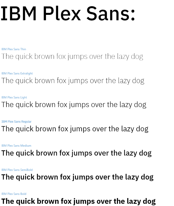
3. Typography
Keyloop use the IBM Plex Sans typeface. It should be used in the creation of all creative assets at Keyloop as it has excellent legibility in print, web, and mobile interfaces.

Typography overview
Plex’s different weights work well independently and even better together. The unexpectedly expressive nature of the italics gives you even more options for your designs.
Currently, IBM Plex Sans supports:Extended Latin, Arabic, Cyrillic, Devanagari, Greek, Hebrew, Japanese, Korean and Thai.
The IBM Plex Sans typeface is available on Adobe and Google fonts in all weights. While it has a lot of weights to choose from, at Keyloop we aim to use the lightest weight possible that still ensures legibility.
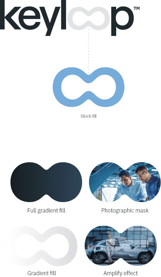
4. Loop device
The Keyloop logo contains ‘the loop’. This can be used as a branding device across our designs.

The loop
4.1
Brand element:
Brand element:
Used sparingly, the loop device is designed to be used as a branded element, either in a lockup with Keyloop designs and imagery, or as a standalone element.
The loop device is designed to be bold and simple.
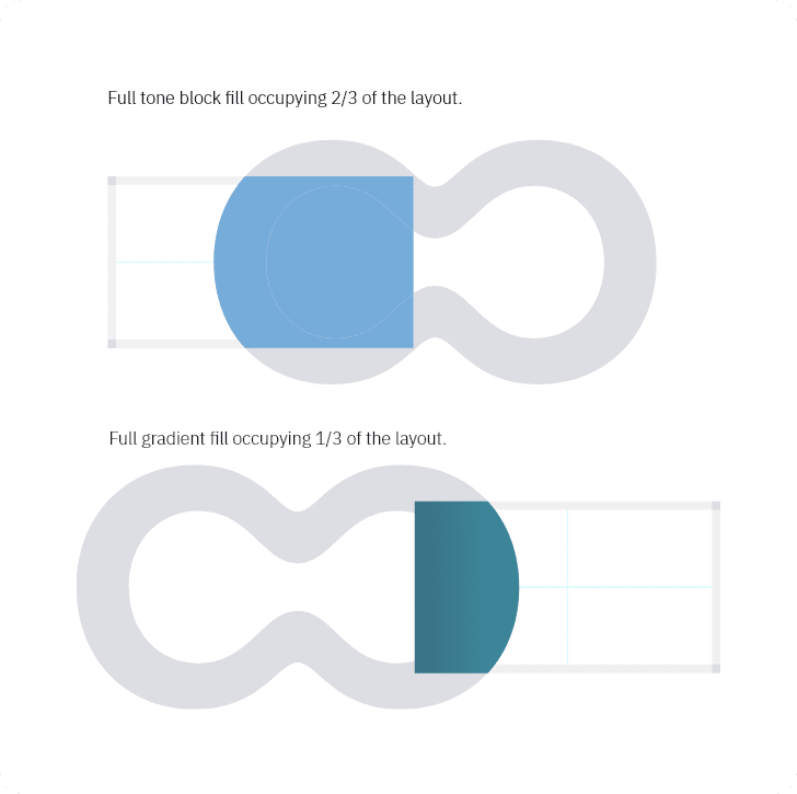
When the loop device is applied, it can be utilised in one of the following ways: full tone colour fill, gradient fill, photographic mask or with an amplify effect.
Loop application
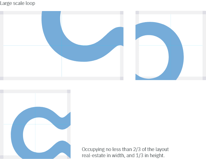
4.2
Large and medium scales:
Large and medium scales:
The loop may also be trimmed horizontally and/or vertically, to give the illusion of extending beyond the layout. The loop may not be trimmed by adjacent images and/or spaces. The loop applied at a large scale must not fill the entire layout, at least 1/3 of available space should still remain visible.
Loop application cont.
4.3
Creating loop spaces:
Creating loop spaces:
The loop can be used to create spaces within a layout.
The loop applied at a large scale must not fill the entire
layout, at least 1/3 of available space should still
remain visible.
Loop spaces can be trimmed horizontally and/or vertically,
to give the illusion of extending beyond the layout.
The loop spaces can be full tone block fill, full
gradient fills or photographic mask.
Loop photography
4.4
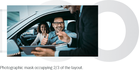
Photographic mask:
Photographic mask:
The loop can be used as photographic masks. They are applied at larger scales to introduce another brand application to imagery that can separate layouts into spaces.
Photographic masks must not fill the entire layout, at least 1/3 of available space should still remain visible.
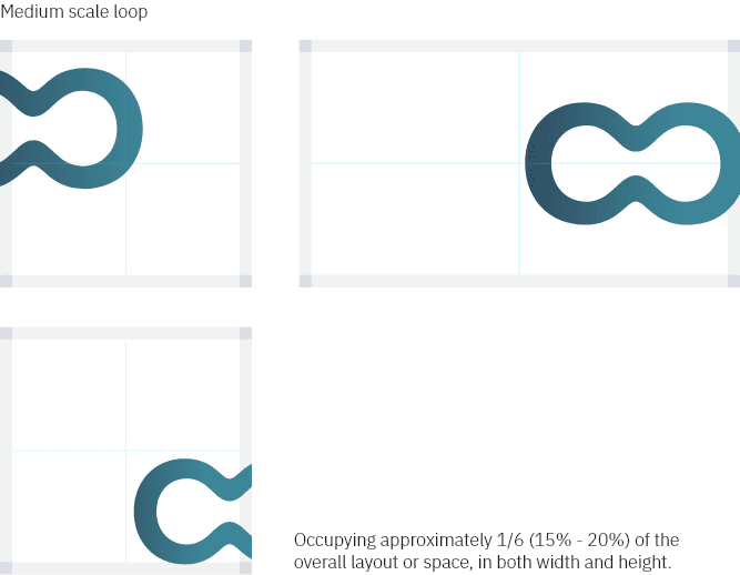
4.5
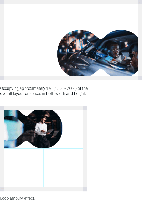
Loop amplify effect:
Loop amplify effect:
The loop device is used to create an amplify effect with imagery. We apply a loop amplify effect at a medium scale to ensure the full effect is visible. Less of the image bleeds off the edge of the layout.
Occupying approximately 1/6 (15% – 20%) of the overall layout or space, in both width and height.
Rounded corners
We use rounded off corners, or radial edges in our designs. Rounded corners are psychologically associated with safety, approachability and friendliness. The application of radial edges means you’re more connected and responsive to our branding.
Rounded corners will draw attention and focus to the centre of the content where the information is. Sharp corners do the complete opposite of this, drawing the eye away from the centre.
Do
Easier to compute information, allowing natural eye movement around shapes:

Do Not

Do
More trusting call to actions:

Do Not

Do
Ability to break down lots of information more easily:

Do Not

Do
Friendlier and more approachable imagery:

Do Not

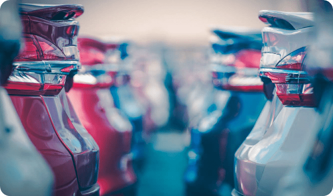
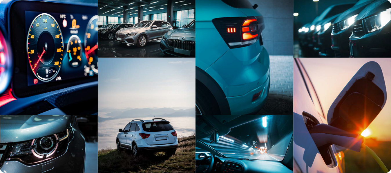
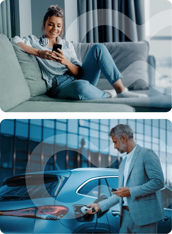
5. Photography
The style is authentic, confident, optimistic and inspiring; all of this is depicted with clarity. Where people are featured, we focus on human dynamacy. The images never look staged or stale. Every single detail should be meticulously considered in the composition. We differentiate ourselves by using photography that’s professional and results-oriented.
All photography should portray true meaning, tell a story, have a clear message and add value to the overall content. We avoid imagery that inaccurately conveys what Keyloop’s vision is, ‘Experience-First’. High resolution photos are essential.
The result is natural, authentic situations. Bright, energetic and people-oriented where possible. Keyloop colours set our photography into the Keyloop world, but we keep subjects natural-looking.
The images are high-quality, powerful, professional and focus on success. They express understatement with a premium standard, balanced with a personal and down-to-earth feel.

Photography: Automotive
Photography: Technology

Photography: People

Loop photography
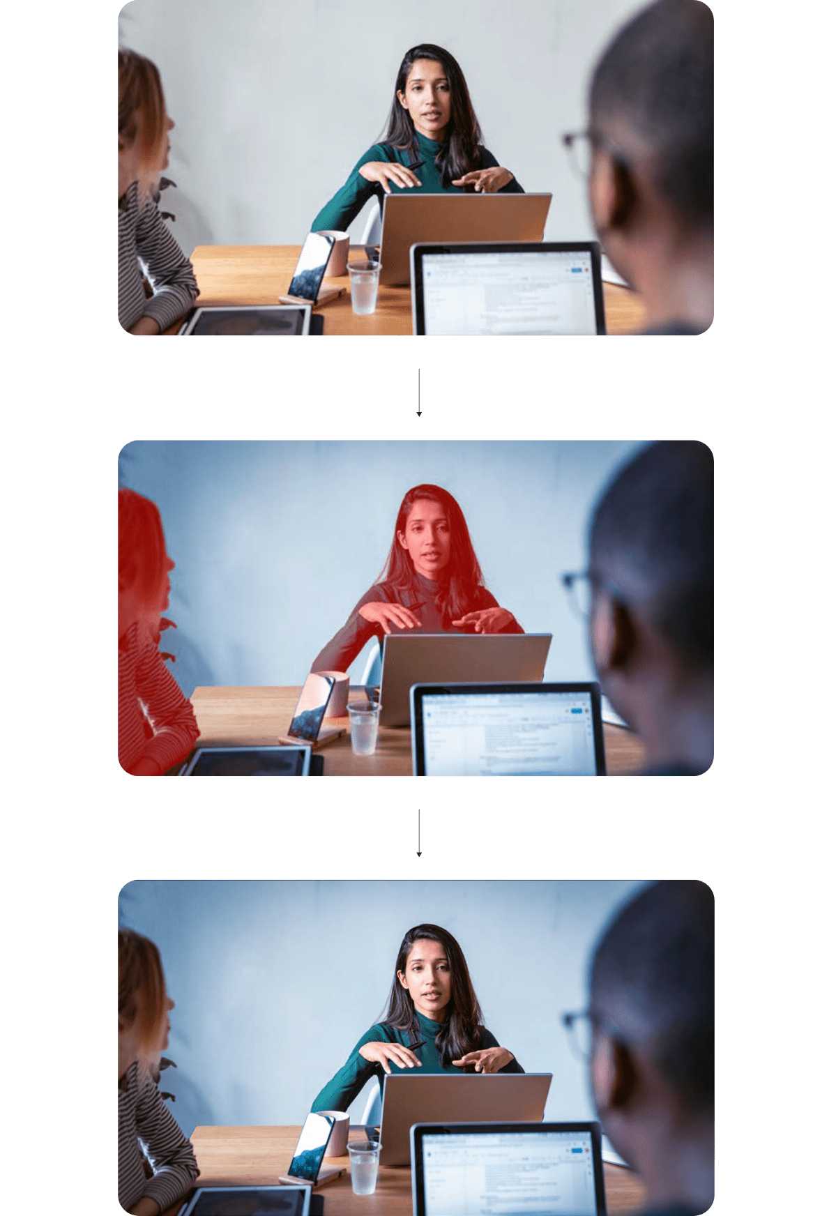
5.1
Horizontal and vertical strips:
Horizontal and vertical strips:
Amplify strips are applied as a pair of two horizontal or vertical strips that overlay the original image. The strips are composed of the primary image with the following attributes:
- a gaussian blur effect applied in increasing value steps across the two strips
- a increase in scale applied in increasing value steps across the two strips

5.2
Loop amplify effect:
Loop amplify effect:
The loop amplify effect adds a gaussian blur layer to a ‘loop photographic mask’ that represents the inner shape of our loop device. The loop amplify is a single overlay step added to the original image. It has the following attributes:
- a gaussian blur effect applied
- a increase in scale applied
Loop imagery
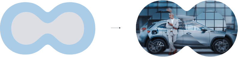
5.3
Setting Keyloop into real-world situations:
Setting Keyloop into real-world situations:
The loop can be used as photographic masks. They are applied at larger scales to introduce another brand application to imagery that can separate layouts into spaces.
Photographic masks must not fill the entire layout, at least 1/3 of available space should still remain visible.
We apply the loop at large and medium scales within the image layout. It is placed between the subject in the foreground and the background. The loop is applied with transparency in a white gradient tone.
Loop application cont.
5.4
Creating loop spaces:
Creating loop spaces:
The loop can be used to create spaces within a layout.
The loop applied at a large scale must not fill the entire layout, at least 1/3 of available space should still remain visible.
Loop spaces can be trimmed horizontally and/or vertically, to give the illusion of extending beyond the layout.
The loop spaces can be full tone block fill, full gradient fills or photographic mask.